Anticipez votre avenir avec T45-AI

Découvrez les tendances de demain grâce à l'analyse prédictive.
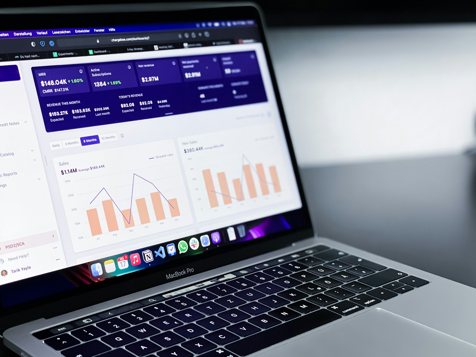
Analyse Prédictive

Anticipez les tendances et réussissez vos projets.

L.ere des Agents AI est a votre porte, saisissez la tendence.

Réussissez grâce à notre expertise en prévisions.

Tendances Futures
Votre Avenir

Votre avenir, notre expertise.

Chez t45-ai, nous transformons l'analyse prédictive en opportunités concrètes pour anticiper les tendances et réussir dans un monde en constante évolution.

A computer screen displaying a data analytics dashboard with graphs and charts. A blue line graph shows fluctuations in data over time, and a section highlights the number of page views. A pie chart is partially visible, indicating a breakdown of different data elements.

80+

15

Confiance, Innovation, Succès.

Clients satisfaits.

Analyse Prédictive

Anticipez les tendances de demain grâce à nos analyses précises et pertinentes.

Anticipation Stratégique

Utilisez nos outils pour prévoir les évolutions du marché et optimiser vos décisions d'affaires.

A computer screen displaying analytics dashboards with various charts, including a line graph on the left and a cohort analysis table on the right. The table is populated with different shades of blue, indicating varying levels of user activity over several weeks. Text labels and numbers detail user retention statistics.
Réussite Assurée

Agissez avec confiance en vous basant sur des données fiables pour garantir votre succès futur.

A bar chart on a piece of torn paper displays data for the years 2018 through 2021. The bars representing 2018, 2019, and 2020 are colored in green and show a declining trend. A red arrow pointing downwards extends from the top of the 2018 bar to the end of the 2020 bar. 2021 is represented by a large red question mark, suggesting uncertainty about the future data.

Avis Clients

Découvrez ce que nos clients pensent de nos services innovants.

Grâce à T45-AI, j'ai anticipé les tendances du marché avec succès.

Jean Dupont
A digital dashboard displaying various analytics charts and graphs. There is a line graph showing user engagement over time on the left, a section with total revenue marked as $74K, and bar charts illustrating user statistics by region. The central section highlights users in the last 30 minutes, focusing on different countries such as the United States, Canada, India, Pakistan, and Brazil.

Lyon

T45-AI m'a aidé à prendre des décisions éclairées et à optimiser mes stratégies commerciales efficacement.

A computer screen displaying an analytics dashboard with metrics such as event activity, showing a current value of 4.7k for today's activity. There are graphs indicating trends and peaks in the data, as well as labels for different types of events.
Marie Curie

Paris

★★★★★
★★★★★
gray computer monitor

Contactez-nous

Pour toute question, n'hésitez pas à nous contacter ici.